Your crowdfunding campaign is a great way to kick off your project’s “brand.” One of the reasons our clients’ campaigns succeed 97% of the time, compared to the industry average of 38%, is that they have a cohesive look that can be sustained throughout the life of their creative work.
1. Iconic image. Your project will need one key image that sums it up. Sometimes our clients hope to wait until after their campaign is finished to have the funds to pay a designer, but it is difficult for a project to be memorable without a representative image. Many of our clients know some basic image software – or someone who does. A good first draft by a talented friend is infinitely better than no image at all. The example below is the “before” and “after” covers from the illustrated novel GroomsDay by Jenny Edmondson.
![]()
Sometimes, the iconic image for the project goes through multiple iterations. All three of the versions below were used at some point before, during, or after the campaign for Sonya Heller’s Americana album 17 West. We discussed the elements of the album cover at length, months ahead of the campaign launch, and then, using free photo editing software, we came up with a draft. When the campaign successfully funded, Sonya paid a professional designer to create an eye-catching album cover.
![]()
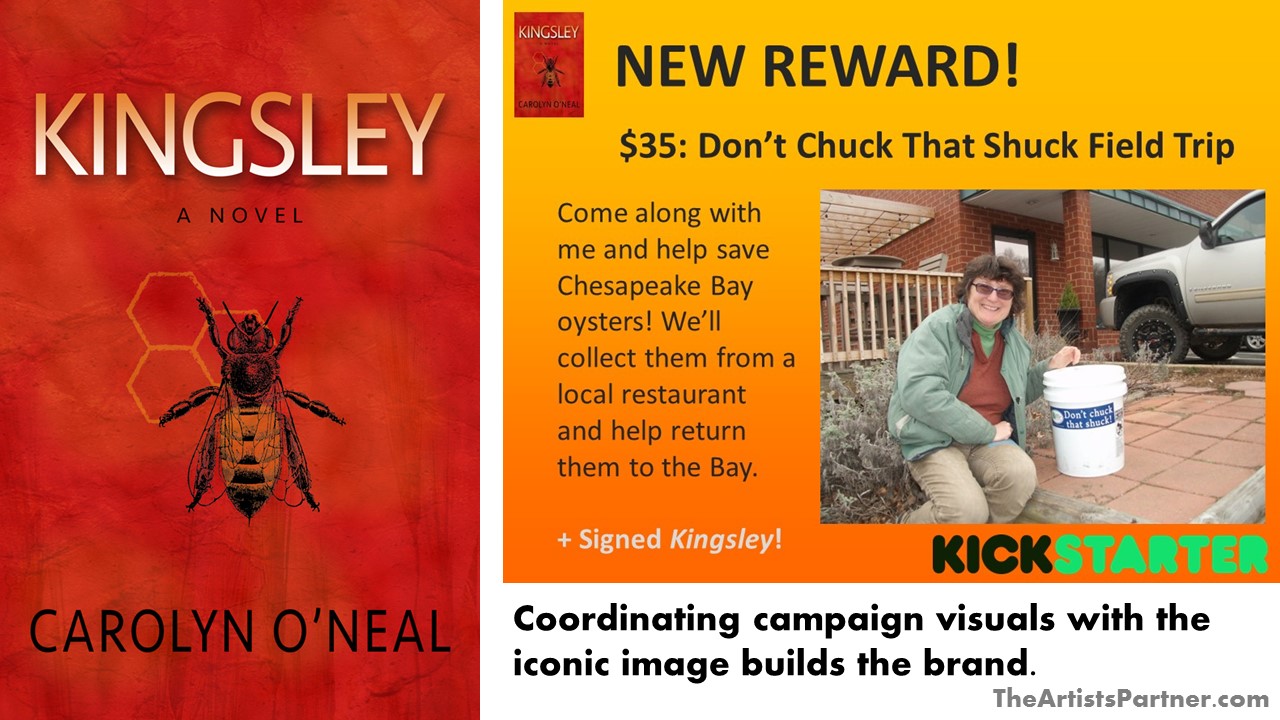
2. Color palette. This is closely related to your iconic image – once you have one, coordinate your campaign visuals with it. This is a great example of a featured reward for eco-thriller Kingsley, using the vibrant color scheme from the book cover.
3. Profile picture. You don’t necessarily need professional head shots. You do need at least one great photo of yourself that fits your project. People respond to faces. Below is an excellent example of Shaun Farris from RED’s Custom Jewelry. This is a candid photo taken while Shaun was doing what he does – make jewelry.

4. Short blurb. You’ve got 135 characters to describe your project. An elevator pitch is something you’ll need time and again, long after your crowdfunding campaign is over. This is an invaluable opportunity to get your message down – and practice repeating it – months before your project launches. A good example is Camila’s Lemonade Stand:
“A picture book about entrepreneurship, tailored to Pre-K imaginations!“
5. Project description. In theory, you can make your description of your project as long as you like. In reality, people will stop reading after a short paragraph. As with the short blurb, this is wonderful marketing training. The following is a tantalizing example from mafia sports memoir Bowling For The Mob:
“Bowling For The Mob is the story of Bob “Perry” Purzycki, a skinny, scrappy Polish kid who at 12 was said to have the potential to become the greatest bowler who ever lived. But in 1970’s Paterson, New Jersey, everybody knew somebody ‘connected’. Training for championships? Fuhgeddabout it. Bob was up to his neck in wiseguys: driving for Uncle Raymond, doing jobs for Bobby Cabert with Nicky The Plumber, and hustling hundreds of g’s in after-hours action bowling for the last Don, John Gotti.“
6. Layout. It’s so easy for a campaign to look boring or messy. The best way to explain an enticing layout is to have a look at one. Take a look at the great campaign for the children’s picture book Princesses Only Wear Putta Puttas by Priya Mahadevan. The sections are clear, the colors complement one another, the headers pop – and Priya immediately begins with her wonderful message.
For a free analysis of your crowdfunding project, please fill out our Artist Questionnaire. We typically respond within two weeks. We look forward to hearing about your project!

3 thoughts on “How to succeed at crowdfunding: Campaign Design”